<- Back to Natstats
NATSTATS Dashboard Explained
Intro \ Backstory
I spent a lot of my day job as a data organizer creating infographics
for IT technical teams and management to get everyone on the same page. This dashboard is another iteration of that
work history and attempts to get riders and organizers on the same page
regarding is an event ‘easy’ or ‘hard’.
Certainly, every rider has their opinion of what is easy and what is
hard. Here we attempt to put some common
structure around those opinions and draw some lines around what’s ‘easy’,
what’s ‘hard’ and expand the thinking to define what’s ‘just right’.
Each year the NATC sends out a survey to the riders and one
of the questions on the survey asks - is an event too easy or too hard? This specific question was bothering me in a
couple of ways. I know as a reader I was having to work too hard to figure out
what the results were trying to tell me but I also had lots of questions:
-
are
the results skewed in some way since not every rider responds to a survey?
-
what
is 'easy', what is 'hard'?
-
which
line(s) of the event are too easy or too hard?
-
what
are the organizers goals for a national event?
-
what
are the riders’ expectations for a national event?
-
is
the rider in the right class?
-
etc.
More questions than answers really so after the 2021 October
meeting I set about figuring out a way to improve on it. This process doesn’t in any way
discount the value of the rider survey, rather the intent here is to perhaps
find a better way to view and evaluate the results of this specific
question.
“Come on let’s dive in already Jonesy….” (Blue italics is my buddy Goober who
came over to go riding.)
Disclaimer: Though I do play an official role in the NATC organization
(I’m the current web admin for mototrials.com) NATSTATS is a completely
separate activity that is my own unsanctioned, independent and creative work
for infotainment purposes only. It is
in no way an official representation of the thoughts or opinions of the Council
(though most think it is ‘pretty cool’).
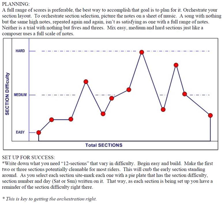
For starters, in case you didn’t know, the NATC organizer
handbook provides guidelines for creating a successful event as shown
below. Basically, a mix of easy, medium
and hard sections. The rider’s scores
are then a reflection of how well the trialsmasters, clerk-of-the-course and
sporting steward did in laying out the course.
“That’s cool”
Of course, weather can be a factor as well raising the difficulty
level significantly even on the best laid out courses but at the end of the day
the rider survey question and this dashboard act as part of the ‘score card’
for the organizers.
First - The Numbers
The color-coded dashboard uses the rider's actual scores as
their 'vote' this way every rider is represented; every line is represented and
every 'vote' is counted.
Actually, almost every 'vote' is counted. If a rider has a statistically extremely high
score or extremely low score relative to everyone else then we exclude those
scores from the calculations. Exclusion
is done using a statistical formula so there is a consistent way to evaluate
the scores versus someone’s subjective opinion. For the math heads out there, we use the Interquartile Range (IQR)
Method with the
R_7 estimate type and interpolation scheme.
This
method seemed like the best fit for our needs and can also be done in Excel
using the QUARTILE.INC() function (“Come on
Smalls you’re killin’ me here - ZZZzzzz…”) . For the conspiracy theorists out there, it’s
an algorithm with a bias in it – deal with it 😊.
The process takes all the finishers’ scores, excludes any
statistical outliers, sums up them up, takes the average and divides by the
number of sections ridden to get the Average Points Per Section for each
line. Digesting just the numbers still
requires some mental math so the next step applied some color coding to make
the chart easy to read at-a-glance. (“I’m not so good at math but I like finger
painting.”)
Second - The Colors
The color-codes more represent the everyday rider
experience. 80% of entrants ride to have
a good time, hang out with their buddies, challenge themselves against the
course and let the chips fall where they may.
Then there are the 20% of riders that show up to compete for every point
and the level of difficultly doesn't really matter - they'll work through it -
the only thing that matters to them is beating the next rider by 1 point. That said, here is where the model ‘draws the
lines’ for the different color levels:
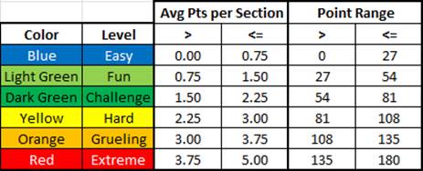
·
The
blue represents a technically easy (but mentally challenging) ride where any
little point taken can move you down the leaderboard pretty quick.
·
The
two shades of green represent what could be considered the 'sweet spot' for a
national. While 80 points might feel a
little heavy to some - it is a national.
It’s okay to be challenged as long as it isn’t dangerous. (“Roger that
Mr. Pocket Protector.”)
·
Yellow
and up just get more physically and mentally challenging. Other factors, like the weather, can come
into play and blow out the scores more.
That said, yellow may be okay for the top two or three lines but going
yellow on the bottom 2 lines (which is 70% of the entrants) and attendance is
likely to drop off.
Third – Usage
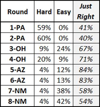
After applying the algorithm and colors to the 2021 data -
over 900 riders and over 43,000 ‘votes’ later - we get the easier to read at a
glance dashboard which closely aligns with the rider survey results (note that
I added the ‘Just Right’ calculation to the survey results). “That’s a
colorful story. I get it now. Are we going riding soon?”
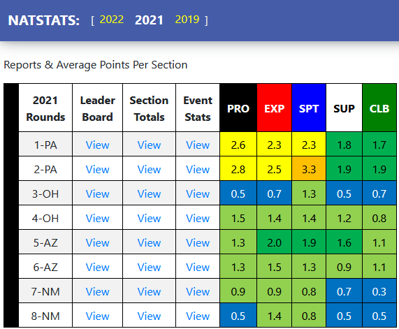
Rather than focusing on any one-color block, the dashboard
should be looked at as a whole.
Organizers can use it to consider what if any changes are needed and riders
can consider and maybe adjust their expectations of what is easy, hard or just
right but both sides are seeing a common view.
Like trials, it is all a balancing act.
Going forward and with the process established, the dashboard
can be updated shortly after each event to provide near real-time feedback and
insight as the season progresses.
Some Outlier Examples
These examples will show how the exclusion process works. (“Exclusion? Doesn’t Ford make those?”) While exclusions may seem overly complicated
and, in some cases, doesn’t move the needle that much, it is necessary to have
a consistent exclusion process. The
extreme scenario was in 2021 where a rider was having some issues and scored
the maximum of 180 points while the average for the rest of the class was just
27 points. If we included the 180, the
average points per section would have been 1.2 but with exclusion the average points
per section is just 0.6. Lastly (“Thank you Lord!”), exclusion doesn’t happen
as much as you might think - 900+ riders in 2021 and only 28 exclusions
(3%).
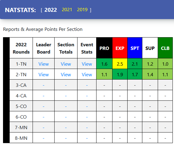
2022 Round 2 in Tennessee - 1.052 average points per section a fun day of riding (“Pat’s my hero.”)
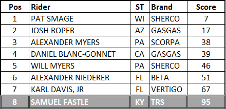
·
If
we do the straight up math, we have a total of 360 points \ 8 riders \
36 sections = 1.25 average points per section
·
If
we exclude outliers, we get a lower bound of -.625 and an upper bound of
88.375 so we’ll exclude Sam’s 95 points to get a total of 265 points \ 7 riders
\ 36 sections = 1.052 average points per section (which rounds up to 1.1
on the dashboard)
·
A
decrease in the rating of .2
2021 – Round 1 in Pennsylvania. Somewhat of a rare
situation so it is interesting to look at
(“Whatever you say pocket protector…”) an exclusion on both the
upper and lower bounds yields a 2.61 average points per section a hard
yellow day of riding but they are Pros they can handle it. Exclusion of the low score doesn’t happen
very often but when it does it’s usually in the Pro class and under difficult
conditions which shows greatness separating from goodness. (“Oh well that is kinda interestin’”)
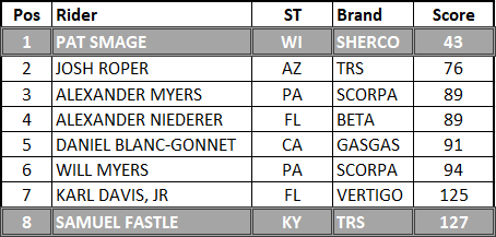
·
If
we do the straight up math, we have a total of 734 points \ 8 riders \
36 sections = 2.55 points per section.
·
If
we exclude outliers, we get a lower bound of 61.75 and an upper bound of
125.75 so we’ll exclude both Pat’s 43 and Sam’s 127 points to get a total of
564 points \ 6 riders \ 36 sections = 2.61 average points per section
(which rounds up to 2.6 on the dashboard)
·
A
small increase in the rating of .07
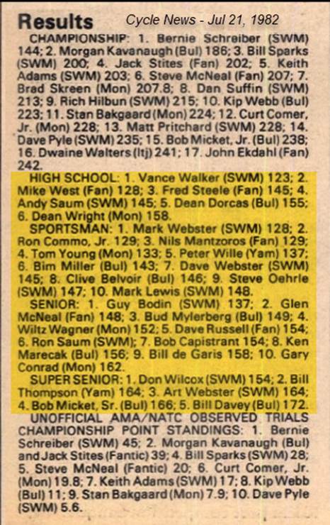
1982 – Whitefish, Montana. The highest
scoring trial in NATC history - 3.64 average points per section a
grueling orange day of riding and another example of greatness separating from
goodness.
Of course, things were a little different in 1982 – 20
sections x 3 loops and challenging weather conditions blew out the course. But using the algorithm we can compare the
past to the present. Also, it is
interesting to note how many future NATC Hall-Of-Fame riders attended this
event.
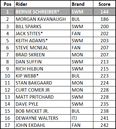
* NATC Hall Of Fame members
·
If
we do the straight up math, we have a total of 3636 points \ 17 riders \
60 sections = 3.56 points per section.
·
If
we exclude outliers, we get a lower bound of 165.5 and an upper bound of
265.5 so we’ll exclude Bernie’s 144 points to get a total of 3492 points \ 16
riders \ 60 sections = 3.64 average points per section
·
An
increase in the rating of .08
Okay last one I promise (“Wait
you said the last one was the last one?”) – This is what Red looks like - 4.11 Average Points per Section. The Support line at that same 1982 Whitefish,
Montana event. They rode 12 sections x 3
loops so a max of 180 points - just like today.
“Dude, that’s a lot a points right
there.” The sections were so
slick and blown out that in some cases riders just ‘took a 5’ and moved on so
I’m told.
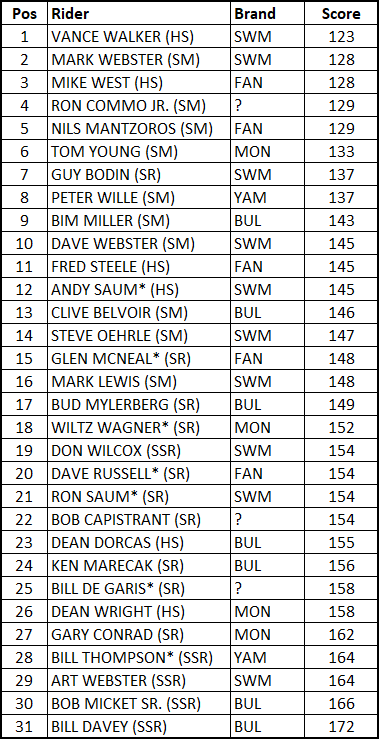
* NATC Hall Of Fame members
Note the older rider got the benefit of doubt for any tie-breakers.
·
If
we do the straight up math, we have a total of 4583 points \ 31 riders \
36 sections = average 4.11 points per section.
·
In
this case there are no exclusions lower bound is 116.75 and upper bound is
178.75
Wrap-Up
There you have it, a look at the dark arts behind this
points-based approach to evaluating each line at an event.
HUGE shoutout of THANKS to all the checkers, the scoring
crews, the data entry folks and the techno wizards that create all the data
making this fun little exercise possible.
Comments, questions and\or concerns can be addressed to natstats@tutanota.com
“Okay that wasn’t too bad geek squad, now let’s
go ride!” Indeed let’s go!